L’articolo è stato aggiunto alla lista dei desideri
IBS.it, l'altro eCommerce
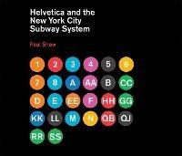
Helvetica and the New York City Subway System: The True (Maybe) Story
Cliccando su “Conferma” dichiari che il contenuto da te inserito è conforme alle Condizioni Generali d’Uso del Sito ed alle Linee Guida sui Contenuti Vietati. Puoi rileggere e modificare e successivamente confermare il tuo contenuto. Tra poche ore lo troverai online (in caso contrario verifica la conformità del contenuto alle policy del Sito).
Grazie per la tua recensione!
Tra poche ore la vedrai online (in caso contrario verifica la conformità del testo alle nostre linee guida). Dopo la pubblicazione per te +4 punti


Tutti i formati ed edizioni
How New York City subways signage evolved from a "visual mess" to a uniform system with Helvetica triumphant. For years, the signs in the New York City subway system were a bewildering hodge-podge of lettering styles, sizes, shapes, materials, colors, and messages. The original mosaics (dating from as early as 1904), displaying a variety of serif and sans serif letters and decorative elements, were supplemented by signs in terracotta and cut stone. Over the years, enamel signs identifying stations and warning riders not to spit, smoke, or cross the tracks were added to the mix. Efforts to untangle this visual mess began in the mid-1960s, when the city transit authority hired the design firm Unimark International to create a clear and consistent sign system. We can see the results today in the white-on-black signs throughout the subway system, displaying station names, directions, and instructions in crisp Helvetica. This book tells the story of how typographic order triumphed over chaos. The process didn't go smoothly or quickly. At one point New York Times architecture writer Paul Goldberger declared that the signs were so confusing one almost wished that they weren't there at all. Legend has it that Helvetica came in and vanquished the competition. Paul Shaw shows that it didn't happen that way-that, in fact, for various reasons (expense, the limitations of the transit authority sign shop), the typeface overhaul of the 1960s began not with Helvetica but with its forebear, Standard (AKA Akzidenz Grotesk). It wasn't until the 1980s and 1990s that Helvetica became ubiquitous. Shaw describes the slow typographic changeover (supplementing his text with more than 250 images-photographs, sketches, type samples, and documents). He places this signage evolution in the context of the history of the New York City subway system, of 1960s transportation signage, of Unimark International, and of Helvetica itself.
L'articolo è stato aggiunto al carrello
L’articolo è stato aggiunto alla lista dei desideri


